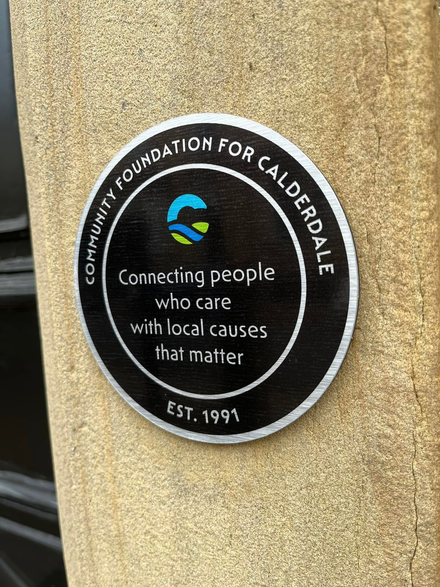
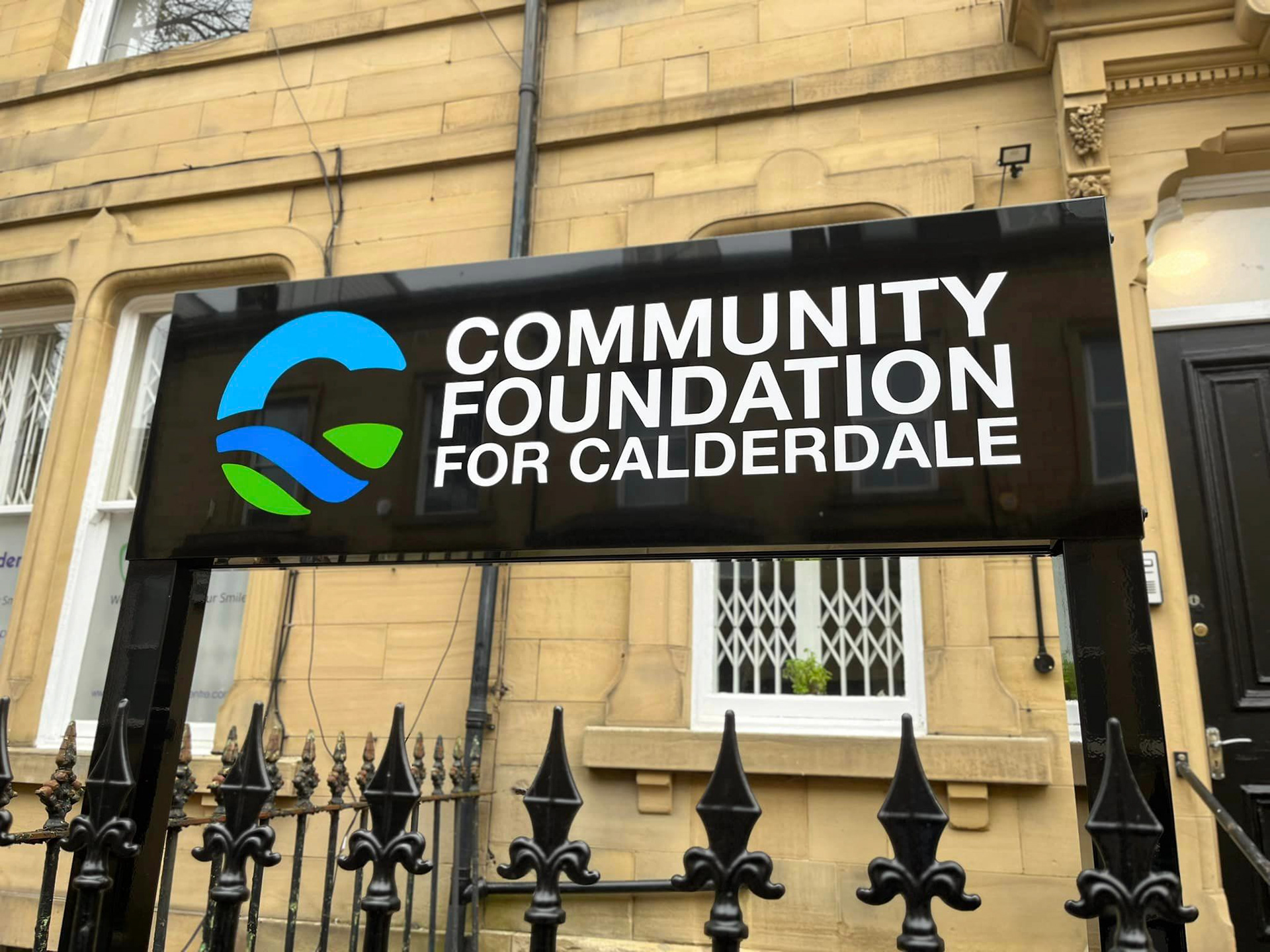
Steve Duncan DL, CEO of CFFC contacted me to ask if I would create a new 'C' icon/motif to accompany the existing logotype. The brief was to create a symbol which encapsulated Calderdale and could also be used as a 'stand alone' mark for members to wear as a lapel badge. Inspiration was taken from the local landscape (sky, water, land) for the 'C' structure, with vibrant blues symbolising stability, inspiration, wisdom, and green displaying fresh growth, balance and harmony.
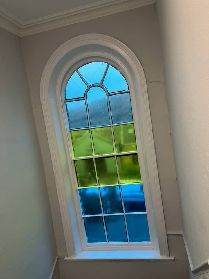
Project extent: Motif logo design, external signage, entrance plaque, internal graphics, vinyl cut lettering and window vinyl.
Another superb print & install job by Dan & Paul at Briggs Priestley Ltd.
